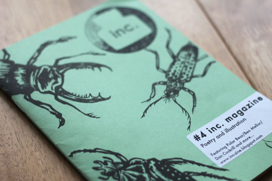
inc. magazine is a poetry and illustration fanzine edited and collated by Will Coldwell (WC) and Anya Pearson (AP). Here they give us insights into what the role of music has been in the zine's creation and what it means to be 'poemed'.
Please tell us a little something about your backgrounds, how you came to be affiliated with Soul Rub Collective and how your zine inc. magazine came about.
WC - Soul Rub was started a few years ago by Greg Sanders, a friend of mine I've known since school who is a musician and formed it to help increase collaborations and events with various other musicians and groups that we know. Much to my disappointment, my musical ability was never quite up to the same level as these guys, but I've always loved zines and writing, so I thought I would contribute to the collective in a way that I could do best, rather than hitting a triangle in the corner of the stage... It made a lot of sense since a lot of the musicians in Soul Rub write poetry, perform spoken word, and rap, and every issue so far has had contributions from them. Our launch parties have also featured performances from bands such as Fur and ourselves and other poets who have been in inc. often perform at Word Is Born, a monthly night organised by Soul Rub. I think Greg put in £20 to help print the first issue (which was actually about 50% of the costs...but you know how these things are!)
AP - As well as being big fans of the Soul Rub guys, I've been writing songs and playing in bands for years and I started to write poetry as a natural progression from that. I think we started the zine during the same period I wasn't in a band for a while, so I threw my energy into making that happen instead. Now I'm juggling both, which is even better, though maybe a bit time consuming! It also makes it hard to decide whether a piece of writing should be a song lyric or poem.
inc. magazine brings together 'spoken word', slam poets, etc. alongside emerging UK-based illustrators. In what way do you see this fanzine as a form of collaboration? How important is the resulting visual aesthetic?
WC - Issue 3 was the issue where we really nailed the concept for what we wanted inc. to be in terms of visual aesthetic, and in terms of how we wanted it to be a form of collaboration. We had enough money to pay for beautiful risograph printing and we teamed up with Illustrators Elbow collective who did all the images for the issue. Half the issue was poems that had been illustration and the second half was illustrations that had been 'poemed'. We decided that we wanted inc. to challenge the traditional way of presenting poetry where the illustrators just respond to it in quite a passive way, and bring them in on the game. It worked really well, and we decided from then on that each new issue should have another dimension to it, controlling the way the poets and illustrators engage. This is great fun for us - because we get to come up with the rules!
AP - Issue number 4 was a chain, where we just sent either the poet or illustrator a piece and they had to respond to it blindly. It makes the whole construction of the issue a collaboration because in some ways everyone who contributes is made to engage with the idea of it, rather than it just being a passive collection of work. Nobody knew how that one was going to turn out, and some pretty unlikely themes grew out of it, including skinny dipping and murder. You can just about follow the connection between those two, I guess....
WC - Yeah and the collaboration extends into our launch parties where the poets, many of whom are performance poets get a chance to do their thing, there's live illustration and most of all its a chance for everyone involved to meet each other. It's quite sweet seeing the poets and illustrators go and find the person who had interpreted their work and then having a drink with them. Heartwarming stuff!
How might you differentiate inc. magazine (if you consider it to be a fanzine) from what we would normally categorize in poetry and literary publishing as 'little magazines'?
WC - Well I suppose we blur the line between a traditional fanzine and an art book or poetry pamphlet. I would like to think of it as a zine because it started in response to a scene and what was happening around us at the time, which was poetry and spoken word in particular becoming really popular and people we knew putting on events mixing hip hop/spoken word and music all together. A lot of zines are made when people get together and cut and paste stuff onto paper and I like to think inc. is a bit like that because everyone is in on the idea from the moment we start the issue. More traditional poetry or literary magazine seem to have a more formal approach to their contributors and are about showcasing what they feel is the 'best' stuff around. We see each inc. as a project - a lot of the content is 100% original to that issue too. If we wanted to just publish some good poetry then I guess we could but for us its very much about the production of the issue, and this is something I've always associated with zinemaking. I suppose because we try to invest a lot of time into the design it could be seen as more of an art book, but I don't worry too much about defining it. It seems to work for everyone involved!
AP - Some bookshops were a little iffy stocking us when we first started out, but I think inc. looks more like a 'little magazine' nowadays - we look a lot more crisp and well-made from the outside even if we're zine-y within. I think we were called a 'comp-zine' once by a reviewer. You won't catch us in WHSmith anytime soon though.
What is the role of your blog/Twitter and how does it work in relationship to the printed zine?
AP - Our blog is a nice way to showcase poets that we like in between printing issues, but we also host a lot of other material on there. Our friend and my bandmate Nick Taylor makes fantastic podcasts of our launch events which have recordings of poems and interviews. They're really atmospheric - there's a lot of whooping and cheering in between sets. We also host on issuu past issues because we only make small runs and its nice to let people see it after we've sold them all. I've got mixed feelings about Twitter but I have to admit it's just amazing in terms of reaching specific networks and getting the word out there. Since we set up our account we've managed to gain loads more poets and illustrators and its great for promoting our launch parties and even encouraging people part with their cash and buy a copy!
Finally, any other zines you might recommend for us to read, and please tell us why.
AP - We work with Nick Murray and his Annexe magazine quite a lot, which are great. Recently he was part of an exhibition with Ladies of the Press, where he typed up poems and prose onto long strips of paper and wound them in old cassette tapes, so you read them as they run between the spools, which I submitted a short piece too. There's lots of interesting material on his website, including a series called 'Two Poems' where people perform one of their own pieces, and one piece that's inspired them. We're also plotting and planning an installation for our next launch party together. He calls Annexe 'a love letter to the written word' which is pretty apt I think.
WC - Conceptually, I fell in love with The Rashomon Effect the moment I heard about it, when I was living in Amsterdam. Its a literary magazine, which features flash fiction, poems and artwork too. But you can't buy it anywhere. Instead they hide it round bookshops in Amsterdam and then just post a list of addresses for you to find it. I think some wound up on the shelves of adult entertainment stores in between the porn mags...I remember spending an afternoon looking but never managed to get a copy, but luckily you can print them from their website for free! I was really happy when they put a short story I wrote in their last issue, and Grant Walker who is part of them has contributed to inc. I think they come pretty slow off the press though...but hopefully they'll keep them coming.


Zine Columbia (2003 - present) is a collaboration between the design and illustration students in the Art + Design Department and students in the Fiction Writing Department at Columbia College Chicago. Design Director and Faculty member Craig Jobson (CJ) and Columbia Senior Graphic Design students Andre LeJune (AL), Susie Capithorne (SC) tell us more about the ongoing project and what the collaboration means to them.
Please tell us a little something about the history and background to Zine Columbia, how and why it came into being.
CJ: Most of the students currently working on a recent issue of Zine Columbia were still in middle school when the zine first began publishing. Then it was a little closer to a “traditional zine” in that the students provided their own copy around a given theme, provided design and art work to support the text, and finally pooled their own finances to get a collection of visual essays published.
SC: Zine Columbia is a student publication whose concept and execution is driven by Craig Jobson. The purpose of the Zine is for senior-level students in either graphic design, illustration, or fiction writing to take their finely tuned art skills and beat them into a pulp and then barf them back onto the page in an energetic, exhaustively backwards way, which usually toes the line between reckless abandon and creative genius. It’s just an exercise, really...
AL: 1. I don’t actually know the history of Zine Columbia, but I gather that it began because the faculty recognized that Zines are one of the last remaining bastions of print publication, and that students should be introduced to and instructed about creating work for a Zine as part of a broad view of publication design. Additionally,I believe it started because of Craig Jobson’s tremendous dedication to being sure his students have access to as many real world experiences in printing and publishing as they can get.
Each issue produced is presented as dual themes (the publication is divided into two halves) such as 'Carnie Milk/Dank Fever'; 'Pickle Stitch/Butter Bound'. Could you say something about the rationale behind this duality and about the process students undertake in naming.
CJ: Two different sections (18 students each) of my Publication Design class meet on different days at different times. Each member of each section is assigned a cover, a TOC and a two page feature. The cover and the TOC are separate design competitions where lone winners are selected by majority vote in each class. Before a cover can be designed each class does a word matrix exercise that can generate over 3,000 names in less than two hours. Each class then votes on a winning name for the semester project. Incidentally, though each feature has it’s own art director, the class must vote the feature into the semester publication. Though each half of the issue is named there is no theme other than the whole publication being “An Anthology of Graphic short Stories.”
SC: Naming the magazine is an illogical process but I think people get the most emotionally invested in it. I actually saw a girl tear up with rage because we weren’t going to call the issue “coconut-flavored fireworks”.
AL: I believe the duality comes down to providing both sections of the class with an opportunity to experience the process of naming a publication of business, and to discuss the practical legal considerations that need to exist side by side with the creative considerations. I think the layout also augments the feeling one has when reading the zine of not knowing quite how or where to begin to tackle the content of “dark human experience” each piece of fiction portrays.
In terms of the content, two terms are used to introduce the style of stories which are contained within the publication. Could you explain what is meant by ‘flash fiction’ and ‘visual stories’ and why Zine Columbia takes this as a starting point.
CJ: In 2009 we moved away from art directors providing the text and we began collaborating with the Fiction Writing Department’s Jotham Burello and his Fiction Writer’s and Publishing class who enthusiastically provided us with “Flash fiction.” This is where our writers pump as much observation and charged language into the 350 - 400 word stories as is humanly possible. “ Visual stories” are what we end up with after the art directors have designed the stories using image making techniques and experimental typography.
SC: Each 2-page spread is like one dream sequence. The‘visual stories’ are the picture parts of the dream; the ‘flash fiction’ is the verbal part, which represent your semi-logical thoughts during the dream. I’m a designer not a writer, so I’d guess from reading Zine Columbia that ‘flash fiction’ refers to stories about drugs, sex, violence, or psychological manipulation... Basically short stories about any of the scary things that you wish you were cool enough to try out in real life..?
AL:The fiction writing students can probably speak to this point better
than I.
As students contributing to this zine, what have you gained from the collaboration and from what you have learned how might you apply this to your own working practices? As a teaching tool, how have the tutors defined this exercise in publishing?
CJ: At the beginning of each semester I share an observation with members of the Publication Design class and who, by the way, will all be graduating at the end of the term or the following term. I tell them that by this time in their academic career there is not a person among them who could not design a beautiful two-page feature for any magazine published in the US. But can any of them design a readable page that establishes new boundaries with type, image and the reader. Can they design “outside the tyranny of the page parameters” ? That’s the challenge of Zine Columbia. Can you break the rules and still be cogent?
SC: I had never before had the chance to work exclusively with a writer and an illustrator on a piece that totally felt like our own. It was a rush to “hire” the illustrator for my 2-page spread, and then be forced to schedule meetings with her every week, and then be solely responsible for representing what we had done together. It pushed me into the risks of professional collaboration, without a stressful monetary component. We only had to deal with signature permission forms.
AL: This publication is an excellent opportunity to work with illustrators and photographers, and learn to collaborate with an outside person and their time constraints to meet your own deadlines. I think it teaches students about communication and scheduling when working collaboratively, and also about the give and take of individuals’ creative visions coming together.
It could be argued that Zine Columbia has taken the format of what we might consider to be a magazine with it glossy pages, DTP, and use of more sophisticated printing production processes rather than a DIY fanzine. In what ways do you feel the publication remains true to it original fanzine ethos? Or, in what ways might you be redefining what a fanzine could be?
CJ: What we do is “graphic design on steroids. “ Students are invited to break the rules with considerable skill in order to create content that is readable, meaningful and graphically imaginative.
SC: Good point. I wonder if we shouldn’t start binding our Zine Columbia issues ourselves, in class. That might be more true to form with the whole ‘zine’ history, right? Why not? I’m going to suggest that to Craig.
AL: Glossy paper does not a magazine make. When introduced to the zine, the designers are asked to take all the rules they’ve learned about traditional typography and break them (with purpose). The writers are creating very non-traditional frequently very dark works of fiction, and the designers and illustrators are asked to make the feel of each story shine through in imagery and non traditional typography and design. From start to finish, all aspects of the zine are utilized to speak to that dark, damaged, and odd side of the human experience presented to the writers in the initial challenge.
And finally, what can we expect from the next issue?
CJ: Better conceptual illustration, more meaningful experimental typography. Covers that should grab you by the seat of your pants and not let go.
SC: This Spring 2012, I am thrilled to have the opportunity to be part of another issue of Zine Columbia. [ Students move pretty fast through Columbia, so it’s kind of rare that we get involved with the publication twice. ] I can tell already that this issue is going to have a totally different vibe that the Winter issue. This Spring’s crew is on a whole other wavelength when compared to the artists of Dank Fever / Carnie Milk. The new zinesters are interested in playing off of historical genres and twisting them into new contexts, whereas previous artists, it seems, were focused on original works of pure fantasy. The Spring 2012 Zine is called Elastic Lumberjack / . I think you should expect to see more emphasis on typographic treatments and more distortions of existing styles. This group doesn’t think twice about mashing up stuff they find lying around and then just using it in their art! ... Is this a product of the social media age, or what? [ Did Gen X just graduate and now it’s all coming from Gen Y?] In any case, I’m curious to see whether design industry people will also notice this shift. [P.S.. I’m sure you won’t recognize actual/specific genres or references. Jobson is super strict about copyrights.]
AL: I think you can expect great design. No layout makes the cut that an extremely competitive and professional group of design students don’t think is A+ work.
Cover Designs: Nazomi Yamawaki (Fuzzy Pucker/Issue 12)/ Elizabeth Puetz (Reckless Cowboy/Issue 12); Shannon Neuner (Dank Fever/Issue 13)/ Vince Desantiago (Carnie Milk/ Issue 13)